Of course the best way to share information is the simplest way possible. But often there is still a case for displaying graphs. Common examples are on publically facing government websites, in annual reports or sharing results on company intranets.
Best practice for graphs and figures would have the graphs produced from a current data stream with markup and interactive engagement. In reality we know that that type of implementation is expensive and best practice is not always possible.
So there is a case still for many graphs to exist as images. With this the case - how do you produce an accessible graph with its content and meaning available for all?
Does it Need to be a Graph?
The first question to ask yourself is... Does this information need to be presented as a graph? Can a table simple table be generated and the data interpreted from the table?
If the answer is no then read on, if the answer is yes then choose to use a responsive data table format, make sure it is neatly formatted and mark it up so it can be read and engaged with by e-readers.
General Rules of Thumb
General advice for producing graphs for web is no different than producing graphs to best practice for publication in print media.
Some key points to consider:
Dont Make Your Users Squint
At the size that the figure/graph will be used (for the web this is usually between 600 and 800px wide) ensure that the axes fonts are approximately the size of the text around it when placed on the page. This usually means at least 18 - 20pt font will work but you may need to change the font size once you see it in context, so prepare for an iteration.
Keep Your Axes Clean
Dont have too many tick marks on your axes, keep the axes as clean as possible. If you want people to be able to see the detail, consider adding a table with the information in a sub tab. If you are going to create data tables we can teach you how to do this accessibly.
Match Your Website Brand
Know the font your website uses and update your figure/graph to use the same font. We recommend that you use the website body text and use it. If it is a custom font you may need to install it on your computer to be able to use it in products you use to produce your graphs.
Match the site colour palette. A lot of careful thought and consideration has gone into your company brand and the colour palette of your website. Consider how your figure will sit on the page and ensure that the colours gel with the visual presence.
Consult your company style guide or ask your designer if you are unsure. If you produce graphs frequently ask your designer to specify a colour palette that meets accessibility guidelines for you and set it up in your software.
Provide Clear Information for Vision Impaired Individuals
According to the WHO vision impairment affects more than 285 million globally, read more statistics around vision impairment from the WHO here. If information is important enough to have on your website as graphs for sighted individuals it is important enough to be made available to all users of your website.
There are several approaches to assist those who are experiencing your website with e-readers ensure that your graphs have descriptive captions, if the information being conveyed use alternative text to augment the site content. If complex information is being conveyed in the graph provide a transcription to the graph either in the surrounding text, or if that is not possible in an format that is available to e-readers, effectively an extended alternative image text or alt-text.
Avoid Embedded Text
There are other considerations: avoid text that is embedded in the image, use CSS wherever possible for additional information. For example, do not have graph/figure headings, use the caption feature in the Website CMS instead. This will not only improve the accessibility of the information by all but will decrease the clutter and make your graphical representation clean and crisp.
Many graphs you see will overlay over the graph with descriptive text. This approach locks the information in the text away in the flat graphic and makes it inaccessible to people with vision impairment.
A better approach may be to annotate with symbols and put the annotation in the text around the graph. This makes the descriptive information readable and accessible to all.
For instance in your graph that had time course data, if you want to make an note about a feature on the graph at a specific date. Then you would write in the text below the graph: On the 12th of April 2019 there was an event that saw an increase in the trend.... etc. This makes the annotation accessible even if the image fails or if a reader is vision impaired, is blind or has cataracts with or without the graph itself.
Produce your Graph so All Sighted Users can Interpret it
Colour blindness or colour vision deficiency affect 1 in 8 men and 1 in 200 women on average globally. Dont lock out up to 6.5% of your audience from engaging visually with the information.
What can you do to produce graphs for individuals with colour blindness? Consider interpretation without colour. For example you can use different line styles for different features on the graph. Imagine the graph is black and white, can all of the traces be identified? If so then everyone can read it.
If you use different traces the graph then can be coloured to enhance the aesthetic experience for most of the audience. A coloured figure can make the figure more engaging and visually appealing enhancing the whole page design.
Assessing the Accessibility of Colour Use
Your site colours were probably chosen carefully by your designer as a combination of colours that meet contrast requirements to meet at least the WCAG 2.1 AA accessibility requirements on white or grey or black.
However, this does not mean that they were meant to be used all in one graph or figure together. Review your site colours or work with your designer and consider whether using them in is possible due to the experience of individuals with colour blindness.
For example, recently we were asked to do this review by one of our clients at DDSN Interactive.
The original True colours from the clients site colour palette meet WCAG 2.1 AAA accessibility when used in their designed contexts. In the figure below we assess their use in combination for graphics. In the first figure on the left there are assessment of the True colour palette from the site on the left and how that colour palette is perceived by individuals with three variants of colour blindness, protanopia (prot) ,deuteranopia (deut), tritanopia (trit). I can be observed that three of the six colours (colour 2,4 and 6 if you number top to bottom) are indistinguishable to people with protanopia or deuteranopia when used as lines in a line graph.
In response to this request for colours we proposed a supplementary colour palette for use in line or bar graphs. This colour palette on its own may not look aesthetically pleasing but when it augments the website colour palette the graphs fit nicely and each colour is distinct and perceivable by the largest possible segment of the population.
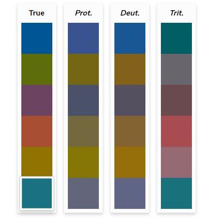
Original website colour palette as experienced by people with true colour compared to the experience of people with protanopia, deuteranopia and tritanopia (left to right)
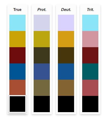
Additional Graph colour palette designed for use in graphs as experienced by people with true colour compared to the experience of people with protanopia, deuteranopia and tritanopia (left to right)
A Useful Tip for Any Graph or Figure
Many people process the graph once and then dont save their working files. This makes minor changes to graphs and figures extremely painful in the future. Do all your colleagues a favour and save the raw graphs, graph interpretation variants and the final production graph as well as captured images of the figures... Please.
Then you can make final adjustments and improvements into the future and change the colour palette of the graph if it is still relevant the next time you rebrand and update your website.
Do you Need Help? Don't have time? Let us just get it done for you!
DDSN has more than 25 years experience producing websites and mobile apps for government and corporations who need to get everything just right. Reach out for assistance with your next rebranding experience to ensure that it is accessible by all of your user base. DDSN partner Danielle Kennedy has a PhD in Chemistry with a specialisaiton in big data visualisation and 54 peer reviewed publications. We know our stuff and Danielle is involved personally in any project involving data representation.
The Form is Submitting
Please do not click your browser's refresh button or navigate away from the form until it has finished submitting.