 The short answer is, no.
Well to be fair, that's not a complete answer.
The longer answer is that if you can understand and deliver the user experience your customers expect when using a mobile device - as opposed to what they expect when using a PC or other traditional web access device - then you should build a mobile website, otherwise you shouldn't.
The Mobile Web Will Take Over
It's been well known for a while now that mobile Internet access will overtake traditional desktop access in terms of usage in the near future. So early technology adopters have spent money creating mobile web presences separately to their main website.
That's largely due to the fact that earlier mobile Internet access devices like phones, Palm smart phones, and Blackberries were fairly limited in their capabilities, or had very small screens. Technologies like WAP and i-mode were bandied about for sending content to these devices. We at DDSN even built some of Telstra's first mobile sites on these systems. You had to write new code for those technologies, and provide different content to what was on your main website.
Today's Mobile Devices Can See Your Website as Intended
But that's all changed now. Almost all of the customers connecting to your website today are using much more advanced mobile devices - like iPhones, iPads, modern Blackberries, Windows Mobile devices, and Android devices. (I'm not guessing, check out the numbers at the end of this article.) If your website has been developed with accessibility best practises in mind and doesn't use Flash, all those devices can see your main website just fine, and the customers are used to it.
So you certainly don't need to build a mobile website simply to be able to connect with your customers. If that's your only reason for building a mobile site, save your money.
Are there other good reasons to consider building a mobile site?
Fruity iThings
I'll head off on a tangent for a moment... When that company with the fruity namesake successfully sold a big bunch of those iThings, we all got a bit confused for a while. This seemingly new idea of downloading "apps" with rich user interfaces to devices we could keep in our pockets made (some of) us user experience designers think that the way customers communicated with companies was suddenly, dramatically, and permanently going to change. Not so. It'll change, but it doesn't seem to be changing very suddenly or dramatically just yet.
Although I do think that there are a few subtle points to appreciate about the success of clever marketing...
For instance, we have a new word in our common vocabulary - "app" - that has its own new meaning beyond the simple abbreviation it used to be. The need to download and buy these "apps" is also worth noting. Downloading is a really old fashioned idea, but it works in this case. Simple minded website developers like us have been building "apps" into websites for years. You can just go to a website and use them, for free. Maybe we missed the point...
By the way, we're not talking about the potential benefits and challenges of building downloadable mobile apps today, but that's a good discussion to come back to in the near future.
Mobile Device Use is Highly Task Focused and the Interface is Different
To reconnect the tangent to our main line of thought, it is clear that mobile devices and the ways they're sold open up some new opportunities. Whether it's playing a game or checking a bank account balance, use of mobile devices for apps and websites is extremely focused and task oriented. Even more so than the use of regular websites.
Also, the user interface issues are quite different, combining new challenges and opportunities for interface developers. No mouse for scrolling and clicking, we use out fingers to drag, swipe, pinch, and tap. The screen is often a lot smaller, but it's easy to zoom in and out, and modern mobile screens are sharp and do have enough pixels on them to show a lot of content.
An Opportunity to Improve the User Experience
We haven't run any user testing workshops directly on this topic so I don't have any qualified evidence, but I'm sure that these user interface differences - coupled with the idea of our Internet devices being in our pockets and always connected - can make a big difference to how we can service our customers.
 The ANZ mobile site is a good example how to take advantage of mobile web access in a pragmatic way. It loads quickly and shows just four links that are easy to read on both smaller and larger screens - connect to Internet banking, contact us, locate us, and a link to the regular ANZ.com. If they did some user research (I guess they did), ANZ noted the key tasks that most mobile device users want to complete and built those into their home page. Then, recognising that the main website will be accessible to most of the rest of the audience, they offered an easy way to get back to it.
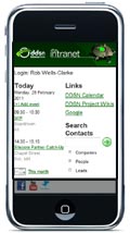
The DDSN intranet website follows a similar approach. Our mobile home page shows today's meetings and reminders, a search box for the company contacts database, a quick link to our project based knowledge wikis, and a link to the full intranet website for everything else.
Before signing off, I'd like to note a few things.
Does Your Site Support Mobile Devices?
Good content management frameworks for websites these days will give you the ability to publish a mobile friendly version of your website fairly easily and cost effectively. Even if you're not altering the content and links that appear on your website for mobile devices, there might be some benefit to your customers just in making the site look a little nicer on small screens, or creating a simple splash page for smaller screens. That's if it only costs you a relatively small amount.
Check your website analytics to see how many users are accessing your site using mobile devices. I think you'll find that the percentage is already much higher than it was a year ago.
Content Should be Mobile Device Friendly, No Matter What
Even though I've argued that a dedicated mobile website is often not needed, it is vitally important to actively consider how mobile devices see your main website.
- If you show important content using Flash, nobody with an iPhone or iPad will see it. You don't necessarily need to throw Flash in the bin, but you do need to offer the content in an alternate format.
- Even Windows Phone based devices or other devices with Flash might have trouble with Flash content looking jerky or running slowly. The web browsing software on most mobile devices is still substantially slower than PCs.
- On the other hand, all the modern mobile web devices that we see accessing websites support JavaScript and CSS and most internationally standard website technologies. So advanced forms and interactive web interfaces can certainly be offered that look great and work everywhere, so long as the designer/developer understands best practice design constraints.
- It is possible for smart web developers to tweak individual widgets on your website for mobile devices. (The recent V/line home page travel search form re-design looks lovely on my PC, but it sure became much harder to use on my iPhone than the previous version.) Even if the same form is used, I'd like it to be more compact to fit on my iPhone screen.
The Numbers Behind the Argument
The stats upon which I've partly based my argument come from a few different sources. I've mostly considered analytics from a range of about 20 of the highest traffic sites among DDSN's customers. I know that's scientifically limited information, but our customers are what we're interested in! There are some important things to note about this data:
- Mobile usage ranges between about 2% and 12% across these sites.
- Most of these sites are Australian sites with Australian audiences.
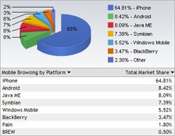
- iPhone and iPad dominate the mobile devices, typically accounting for over 60% of browsers. Android and SymbianOS devices scrape into the top ten devices in some sites. Blackberries and iPods make modest appearances. We did see just a few Playstation 3 browsers, good luck to them!
- Stats from our customers' sites are localised and not necessarily indicative of worldwide trends. In fact they differ to worldwide trends substantially in some areas, such as lingering domination of the Internet Explorer browser.
- Sites generating more traffic or with more public audiences tend toward higher mobile usage.
- There's a broad range of sites in the mix that we considered - non profit organisations, corporate sites, entertainment sites, and government/utility sites.
 There is publicly available data that supports the stats we found among our own customers, such as the graph on the right that came from the Web Developers Notes website in 2010 and this PDF report from AdMob.
On the other hand, there are also recent qualified stats that show that feature phones (not smartphones) might still be accessing the mobile web a lot, but in my brief research I couldn't find anything definitive about what's actually happening in this area.
It should go without saying but I'll say it: Check your own web stats and consider your audience before you decide whether or not to build a separate mobile site.
Build a Mobile Website for the Right Reasons Only
There are some good reasons to build a mobile website. (Did I leave any out?) If you understand your mobile customers' needs and have the capability to address them directly, create a mobile site. Otherwise save your money and have a think about how mobile devices see your main website instead, because they can and do.