Trinity College which is a residential college of the University of Melbourne have been a long term client of DDSN - 3 replatforming projects, 2 UX projects, 2 visual redesigns, 3 student portals and 9 years of continuous improvement and support later...
The case study on this award nominated site focuses on our latest UX and visual redesign project for Trinity College; balancing their prestige brand with a modern youthful appeal.
Timeline of DDSN's Support and Continuous Improvement for Trinity College
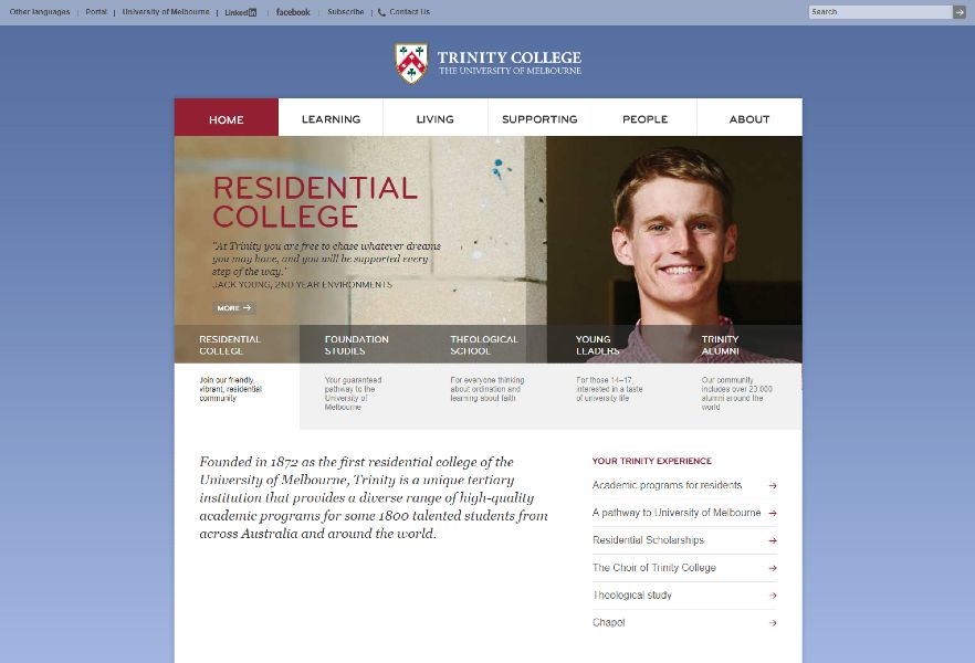 2015 Support and Maintenance of a Legacy System
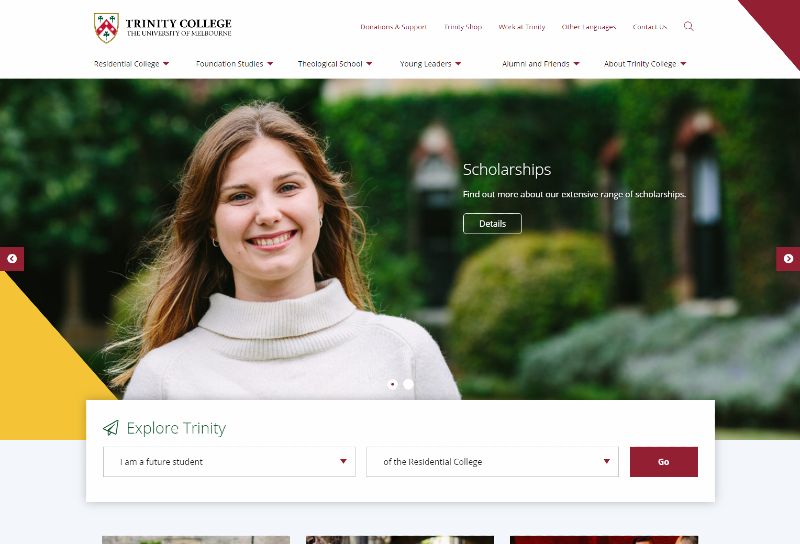 2018 UX, Redesign and Migration to Kentico Portal Engine
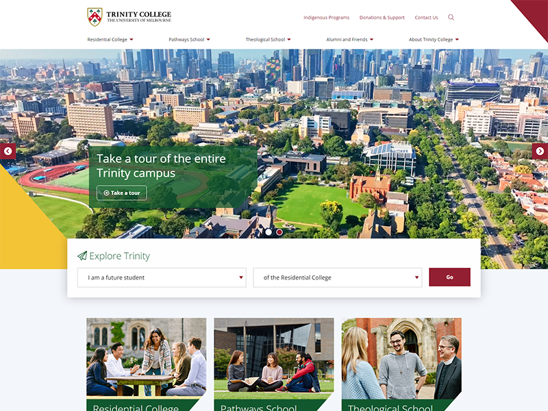 2023 Migration to Kentico 13 MVC
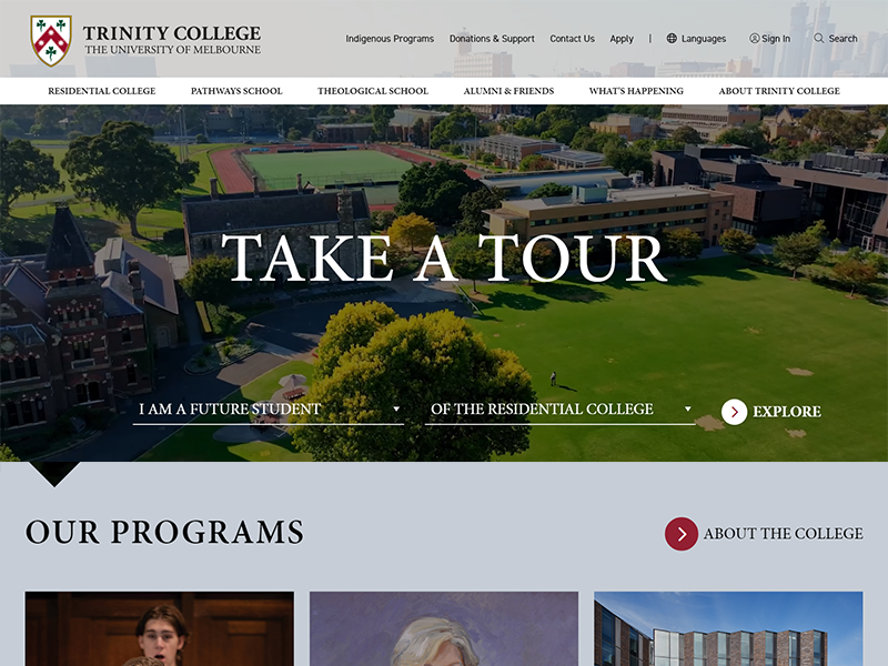 2024 UX study and visual redsign
Find out about our Continuous Improvement Plans
In the ever-evolving landscape of higher education, a strong digital presence is crucial for institutions to attract top-tier students, engage with their community, and showcase their offerings.
Trinity College, the most prestigious institution at the University of Melbourne, recognised the need to enhance its online platform to better serve its diverse audience and reflect its commitment to excellence. This case study explores how our team partnered with Trinity College to transform their digital presence and create a cutting-edge website that not only met but exceeded the college's expectations.
The Landscape
Trinity College, with its rich history and esteemed reputation, faced a common challenge in the digital age: a website that no longer effectively served its purpose. As a prominent college with three distinct student cohorts, Trinity needed an online platform that could effectively communicate with its diverse audience while upholding its prestigious image. DDSN Interactive had been supporting and continuously improving Trinity College's web infrastrure since 2015 through an active engagement plan. This has seen the site be tranformed before, last most significantly in 2018 to create site areas for each of the 'customers' - categories of student that the College serves.
The Challenge
Despite having a solid foundation, Trinity College's website had grown unwieldy over the five years since its last major design overhaul in 2018.
The main issues identified were:
- Content overload: with multiple contributing authors, the site had expanded to over 900 pages, resulting in unnecessary complexity.
- Outdated design: the existing design needed a refresh to align with current trends and appeal to a younger, tech-savvy audience.
- Navigation difficulties: the expanded content made it challenging for users to find relevant information quickly.
- Diverse user needs: the site needed to cater to different student cohorts, each with unique informational requirements.
DDSN's Solution
DDSN approached this complex project with a comprehensive strategy that combined cutting-edge design principles with a deep understanding of the education sector's digital needs. The team employed a user-centric approach, focusing on creating an intuitive and engaging experience for all stakeholders.
 1. User Experience (UX) Studies
DDSN kicked off the project with thorough UX studies to understand user behaviour, preferences, and pain points.
Our approach to the UX redesign of Trinity College’s website was comprehensive, rooted in deep collaboration with key stakeholders and a data-driven process. The goal was to ensure the final product wasn’t just visually appealing but also highly functional, intuitive, and aligned with the needs of its diverse audience.
Discovery Sessions
The project kicked off with a series of discovery sessions with Trinity’s Communications and Marketing team. These sessions allowed us to gather a holistic understanding of the college’s goals, brand positioning, and the specific needs of the different user cohorts they serve—current students, prospective students, international students & parents, as well as alumni. This collaborative approach ensured that every decision was anchored in Trinity’s strategic vision.
Data-Driven Insights
Leveraging the results of Trinity’s 2023 parent and student survey, we delved deep into user behavior, preferences, and expectations. These insights highlighted key areas where the existing website was falling short and guided our focus for the new design. Understanding the pain points and priorities of the users early on was critical to shaping a solution that truly served their needs.
Card Sorting & Information Architecture
With four distinct user cohorts to cater to, organizing the website’s content effectively was essential. To achieve this, we conducted card sorting exercises with representatives from each group. This process helped us determine the most logical and user-friendly way to structure the site’s navigation and content hierarchy. The result was a streamlined information architecture that catered to the specific needs of each audience while maintaining coherence across the platform.
Prototyping & Task Testing
Before any visual design began, we developed a prototype of the website’s structure. We conducted task testing with representatives from all four user cohorts, asking them to complete typical tasks on the site. This hands-on testing allowed us to identify any sticking points or inefficiencies in the user journey early on. Through this iterative process, we refined the prototype, ensuring that it was intuitive, functional, and met the expectations of each group.
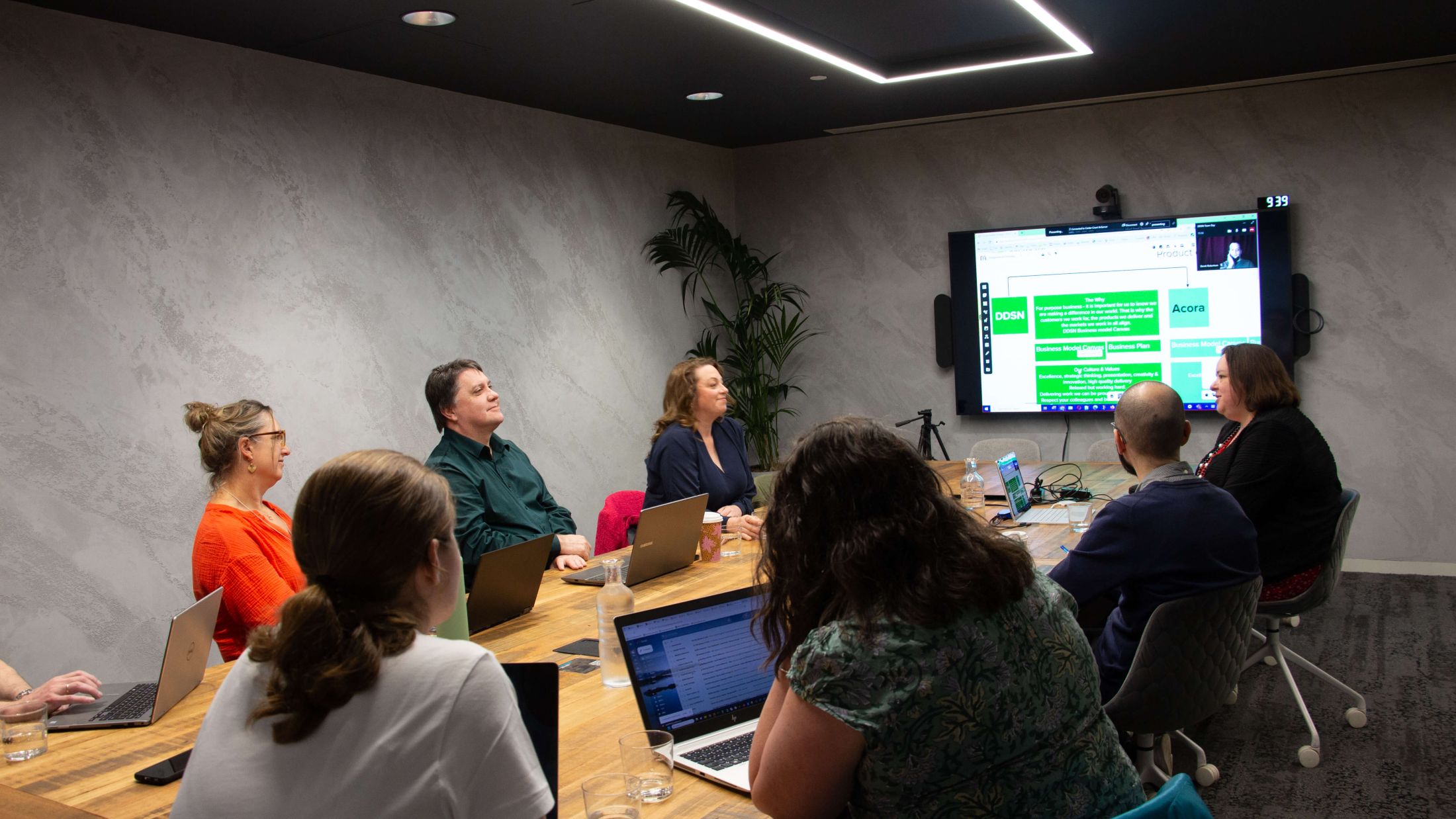 What do UX sessions look like in 2024? A bit like this recent DDSN planning session...
As many people in the room with their laptops so that they can engage with
the digital whiteboard and people online. Our tool of choice - mural.
Iterative Refinement
After gathering feedback from task testing, the prototype underwent several rounds of refinement. Only after we were confident that the UX was smooth and aligned with user needs did we move forward into the visual design phase. This user-first approach ensured that the foundation of the website—its functionality and ease of use—was solid before any aesthetic decisions were made.
This research and analysis laid the foundation for the subsequent design and development stages, ensuring that every decision was grounded in user needs.
At DDSN, we recognize that no two projects are the same. Our approach to UX is never one-size-fits-all; instead, we carefully tailor our methods and exercises to the unique goals and challenges of each client.
Find out more about DDSN's approach to UX
For Trinity College, this meant a meticulous and collaborative process involving in-depth user research, card sorting, prototyping, and iterative testing. By adapting our approach to meet the specific needs of the project, we were able to deliver a solution that not only achieved its objectives but also enhanced the user experience for all audiences. This flexibility and attention to detail are key to ensuring the success of every project we undertake.
2. Information Architecture Analysis
To address the site's complexity, DDSN conducted a comprehensive analysis of the existing information architecture.
Given the complexity of Trinity College’s website, with over 900 pages developed by multiple contributors over the years, addressing the information architecture was a critical focus of the project. The existing site had grown into a sprawling collection of content that made it difficult for users to find relevant information quickly and efficiently. DDSN knew that a strategic overhaul of the site's structure was essential for delivering a user-friendly experience.
A Greenfields Approach
Rather than simply tweaking the existing structure, DDSN and Trinity College took a bold, greenfields approach to completely rethink how content should be organized. We collaborated closely with the Trinity team from the outset, recognizing that this overhaul was not just about reducing page numbers but about creating a logical and intuitive flow that would serve the diverse needs of their users—students, parents, alumni, and prospective applicants.
Streamlining and Simplifying
We began by conducting a thorough audit of the site’s content, identifying redundancies, outdated materials, and areas where information could be consolidated. Through this process, we streamlined the architecture by grouping related content together and eliminating unnecessary pages, ultimately reducing the site’s complexity without sacrificing depth.
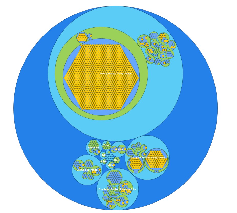 2023 Trinity College site navigation - 4 layers deep with 5 main navigational areas
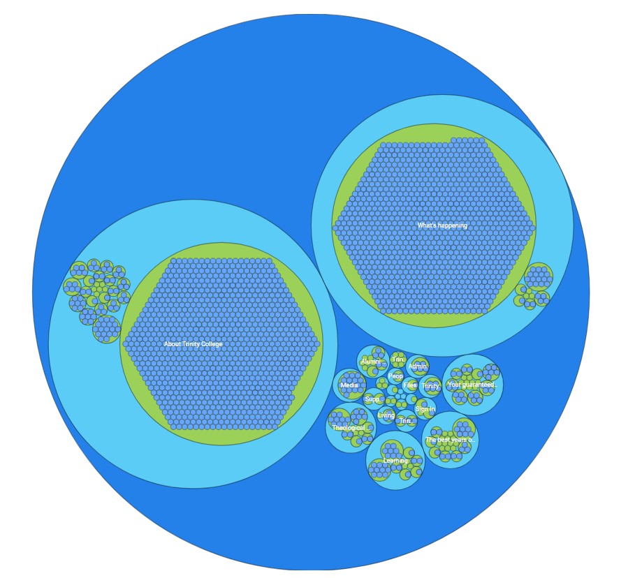 Current site navigation - 3 layers deep with 6 main navigational areas.
Collaborative Restructuring
The new IA was built collaboratively, ensuring that every stakeholder’s input was considered. Working with Trinity College’s team, we created a scalable structure that balanced simplicity with functionality. By simplifying the navigation and focusing on clear, intuitive paths to key content, we helped make the user experience far more efficient. This restructuring not only improved discoverability but also ensured that users would spend less time searching and more time engaging with relevant information.
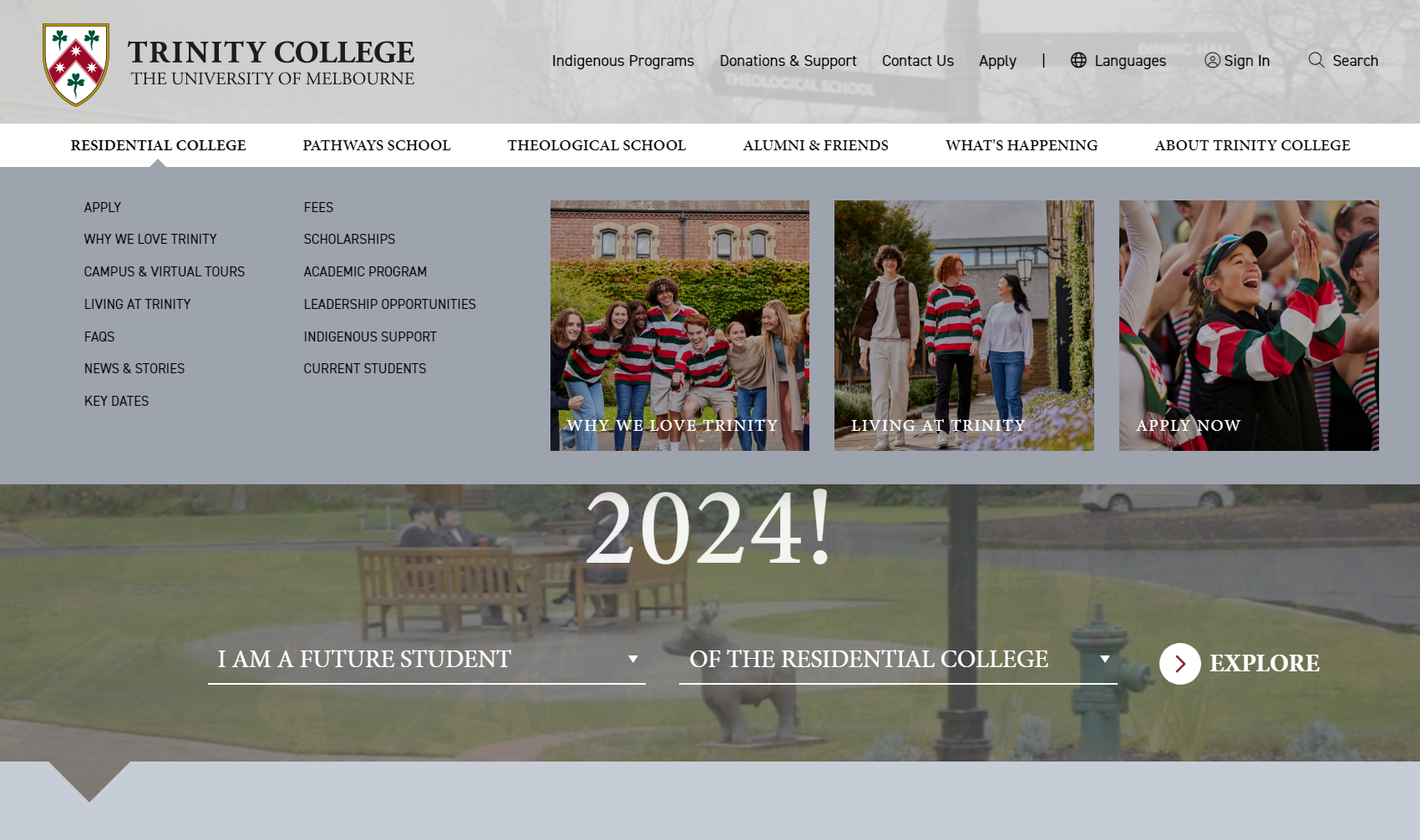 A mega menu was carefully designed for the site to aid in navigation
User-Centric Navigation
To complement the newly optimized architecture, we designed a navigation system that made it easy for users to move between different sections of the site without feeling overwhelmed. By prioritizing the needs of Trinity’s distinct user cohorts, we created tailored navigation paths that guided each group toward the content they needed. This user-centric approach helped ensure that the new site structure not only looked clean and logical but also performed well in the real world, reducing frustration and increasing overall satisfaction.
Over 100 pages were removed as a part of the review. The resultant site structure had an additional navigational area to better serve news and events and reduced the depth of content. In addition dashboards were created for each of the new subsections of the site along to serve as landing pages with infographics and new tag lines to capture the attention of the 4 discrete audiences.
3. Visual Design and Content Design
DDSN implemented a visual design developed through collaboration with Trinity College's visual designer to completely overhaul the look and feel to align with contemporary design trends and directly appeal to the target audience. The new design maintained Trinity College's prestigious brand identity while incorporating visually striking elements that resonated with a younger audience.
Additionally, DDSN introduced various interactive content design elements to engage visitors and deliver information effectively. These dynamic elements helped bring Trinity College's story to life on the digital platform.
4. Development and Search Engine Ranking Retention
DDSN migrated the existing Trinity site to the Kentico Xperience 13 platform, leveraging its capabilities for a seamless and feature-rich digital experience. This migration allowed for enhanced functionality and easier content management.
Alongside the development or a rich range of authoring tools to support the interactive content, DDSN implemented a comprehensive SEO strategy to ensure that the site's structural changes did not compromise its search engine performance. Using the built in features in Kentico Xperience to easily move pages, to automatically create a former url record which creates a permanent redirection. Also Kentico Xperience has a function to redirect pages when they are unpublished which we utilised to archive ~100 pages. Using this combination of process the DDSN and Trinity teams were able to maintain the organic performance of the site through this major restructure project. Alternative urls available to be configured on any Kentico Xperience page were also used where a redirection was not appropriate to capture any other pages that didnt fit the common usecases. This approach ensured that Trinity College's online visibility was not only maintained - but improved.
The Outcome
DDSN's solution resulted in several significant improvements to Trinity College's online presence:
- Retained main navigation: the existing main site navigation, validated through user studies, was retained to maintain familiarity for returning users.
- Customer dashboards: DDSN introduced customer dashboards catering to different student cohorts, allowing them to access relevant information effortlessly. This personalised approach significantly improved user experience.
- Streamlined architecture: by restructuring the site's architecture, DDSN created a more intuitive and user-friendly navigation system that ensured information was easily accessible, even within deep page structures.
- Interactive content: new interactive elements were seamlessly integrated to engage users and deliver information dynamically, making the site more captivating and informative.
- Responsive design: The new website was optimised for all devices, ensuring a consistent experience across desktop, tablet, and mobile platforms.
Results and Impact
Trinity College's collaboration with DDSN yielded impressive results that directly addressed their initial goals:
- Enhanced brand presence: the new visual design maintained the college's prestigious image while appealing to a younger, diverse audience.
- Improved user engagement: the intuitive navigation and personalised dashboards led to significant increases in user engagement and time spent on the site.
- Streamlined information access: the restructured architecture and interactive elements made it easier for all user groups to find relevant information quickly.
- Increased applications: While specific numbers weren't provided, the college reported an uptick in high-quality student applications, attributing this partly to the improved digital experience.
- Stronger community engagement: the new platform provided better tools for fostering community interaction among current students, staff, and alumni.
The successful redesign of Trinity College's website demonstrates DDSN's ability to deliver high-quality, user-centric digital solutions in the education sector. By combining innovative design with robust functionality and a deep understanding of the client's needs, DDSN helped Trinity College strengthen its online presence, improve user engagement, and streamline its digital operations.
This project showcases how a well-executed website redesign can have a significant impact on an educational institution's ability to attract and engage its target audience. As digital landscapes continue to evolve, DDSN remains committed to helping clients like Trinity College stay at the forefront of web design and user experience, ensuring they continue to attract and nurture the brightest minds of the future.
Team Work!
No project comes together without the right people behind it, and this one was no exception. Our team at DDSN brought together a diverse group of experts, each playing a crucial role in delivering a site that truly exceeded expectations. Together, this team turned a complex vision into a sleek, user-friendly reality. Their collaboration and expertise were the driving forces behind the success of the Trinity College UX and visual redesign.
 Vanessa, with her thinking cap firmly on, led the business analysis for the project, teasing out the complexities of the information architecture.
 Rob, our senior designer, transformed the collective vision into a stunning reality, balancing Trinity’s prestige with a modern aesthetic.
 Jackie, a wizard with prototypes, was instrumental in building interactive models and conducting user task testing to ensure everything functions flawlessly.
 Greg, our senior engineer, ensured the Kentico Xperience infrastructure was rock-solid, bringing the technical backbone to life.